
 genshin-home.png

 Project Properties
Genshin Impact Informational Website
- Tool
- Figma
- Role
- User Interface Designer
- Timeline
- 2 months
overview.txtOverview
I was tasked with creating an informational website that shows a strong understanding of design principles and teaches users about a topic of my choosing. I chose Genshin Impact, a game I play, and focused on the game’s seven regions and its elemental combat system.
goals.txtGoals
My goal was to challenge myself to follow Genshin Impact’s visual branding standards while applying the design principles I had learned to make the user experience as smooth as possible. I pushed myself to dig into each principle and apply it in multiple places at once.
process.txtProcess
My first step was to review the design principles and document how each one would be used in the final design. Then I moved into Figma and began prototyping, using the proposal as my guide.
proposal.txtProposal
I used user interface design principles to plan my interface before starting the design itself, which at first felt unfamiliar. In past projects, I jumped straight into designing and followed wherever my ideas took me. This proposal showed me the value of planning design elements before building them. Use the link below to view my proposal and see where each concept appears in the final project.
View Project Proposalproposal.png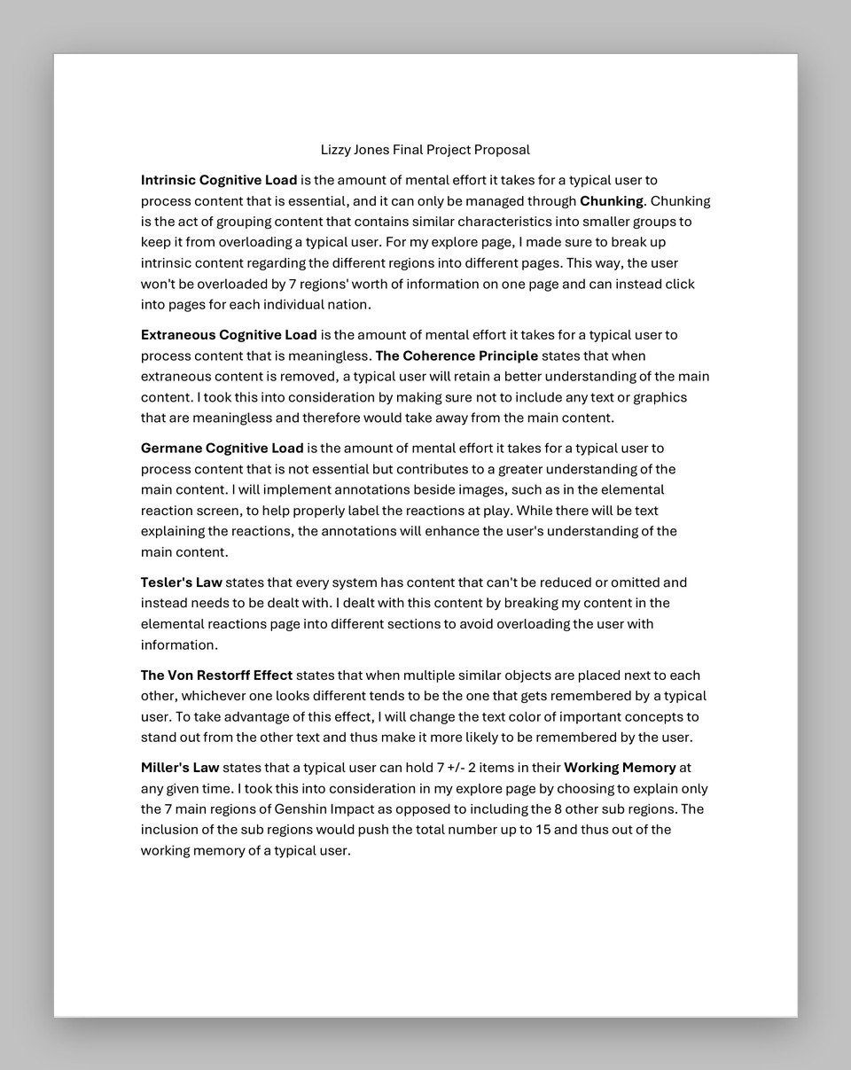
User Interface Design Concepts
von-restorff-effect.txtThe Von Restorff Effect
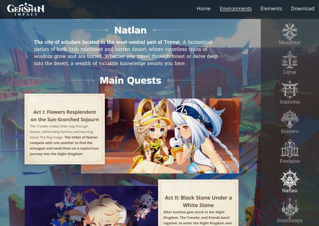
The Von Restorff Effect states that when similar objects are placed together, the one that looks different is the one a user is most likely to remember. To use this effect, I bolded the most important text in every text box. When summarizing each act of the main quests, I bolded the key story beats so users get a clear sense of each region’s story at a glance.
mondstadt.png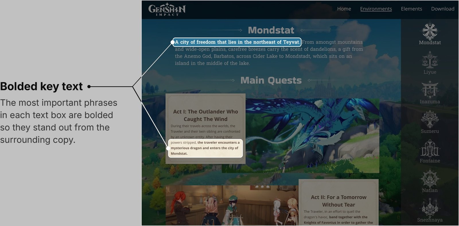 sumeru.png
 millers-law.txt
Miller’s Law
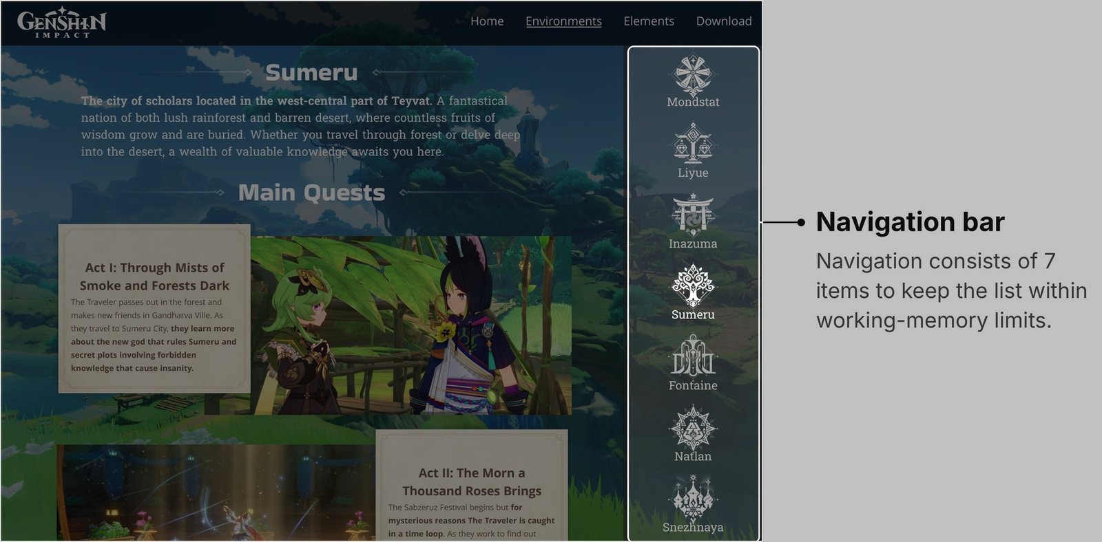
Miller’s Law states that the average user can hold 7 ± 2 items in their working memory at once. To follow this principle, I covered only Genshin Impact’s seven main regions instead of every subregion. Including the subregions would have brought the total to 15, well outside the limits of Miller’s Law.
spatial-contiguity.txtThe Spatial Contiguity Principle
The Spatial Contiguity Principle states that users learn better when related images and text are placed close together. I applied this by keeping my annotations right next to the parts of each image they describe, so users know exactly what each one refers to.
electro-charged.png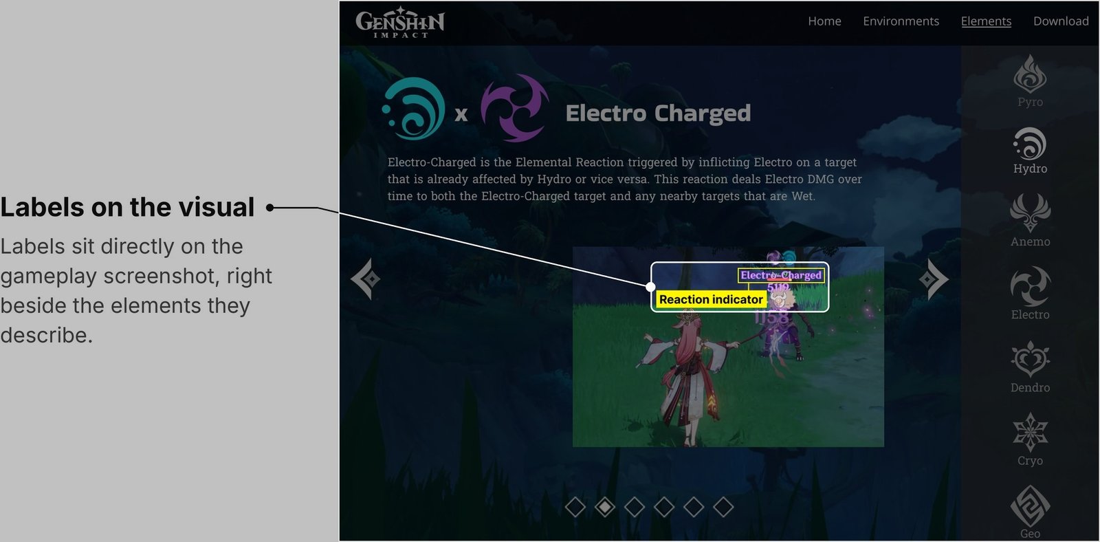 natlan.png
 prototype.txt
Prototype
Over four weeks, I built a prototype that matched Genshin Impact’s branding standards while incorporating the design principles I had learned. The site guides users through the game’s seven regions, giving an overview of each region’s main quests and an introduction to the god who rules it. It also explores the elemental combat system in depth, showcasing all 27+ elemental reactions in the game. You can view the full prototype below.
View Figma Prototypetakeaways.txtTakeaways
One of the biggest lessons I learned was the importance of designing with intention. There is a reason behind the placement and appearance of every element, and making choices without understanding why they matter can be risky.
I also learned to let go of design elements I liked once I realized they didn’t align with design principles. My scroll bars were originally unconventional, and I enjoyed the uniqueness they brought. However, I realized their design wouldn’t follow Jakob’s Law and could confuse and frustrate users.
Overall, this project showed me how much thought goes into every design, since so many factors must be considered to make the experience smooth for every user. As designers, it’s up to us to meet the needs of the user.